Gender Pay Gap in the United States

The infographic titled “Gender Pay Gap in the United States, September 18, 2023” by Andrea Pozderac and Azra K. Nurkic, sheds light on the persistent gender wage disparity in the U.S. In 2023, women earned 84.5 cents for every dollar earned by men, indicating a 15.5 cent gap. The infographic explores various factors contributing to this gap, such as occupational segregation, work experience, and educational attainment. It also highlights state-wise disparities, with Connecticut showing the smallest gap and Utah the largest. Additionally, it underscores the overrepresentation of women in lower-paying jobs and the challenges faced by women of color.
Empowering Decisions With Data: How Data Analysis Drives Esg Compliance And Sustainable Business Practices

In today’s competitive business landscape, evidence-based decision-making is vital for the success and longevity of organizations. It allows companies to identify potential risks and opportunities, allocate resources efficiently, and adapt to changing market conditions. Compliance with environmental, social, and governance (ESG) regulations and industry standards is crucial for mitigating legal and financial risks, and maintaining a loyal and growing customer base. Data analysis plays an essential role in informing business decision-making and ensuring adherence to these regulations and standards, which in turn impacts long-term business performance.
This article, written for the Small Business Association for International Companies (SBAIC) discusses the importance of harnessing data analysis for ESG compliance and sustainable business practices, developing learning agendas for effective ESG compliance management, and provides five illustrative learning questions that can be used to guide ESG and sustainable performance data analysis.
Findings of a Baseline Study in Maharashtra: State of Water & Women’s Empowerment

This infographic highlights some of the key findings from a Women + Water baseline study documenting water supply availability and the state of women’s empowerment in India’s Maharashtra state. The Institute for Development Impact conducted the study on behalf of the W+W Alliance.
Women’s Agency and Self Efficacy in Maharashtra and Madhya Pradesh

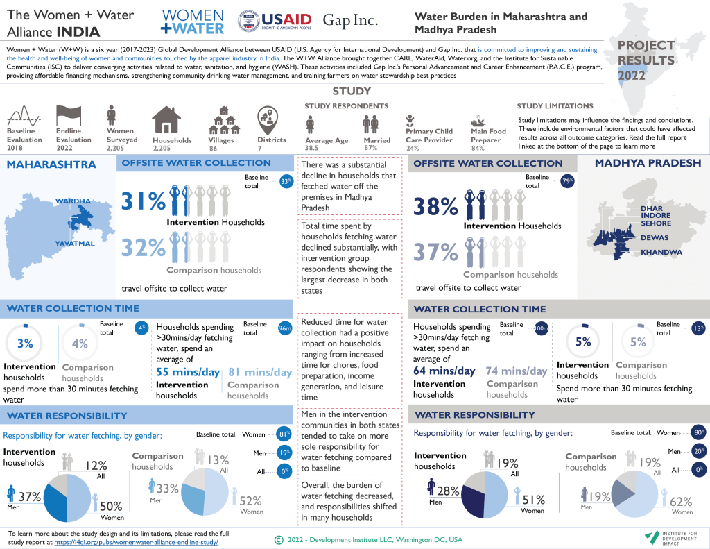
Water Burden in Maharashtra and Madhya Pradesh
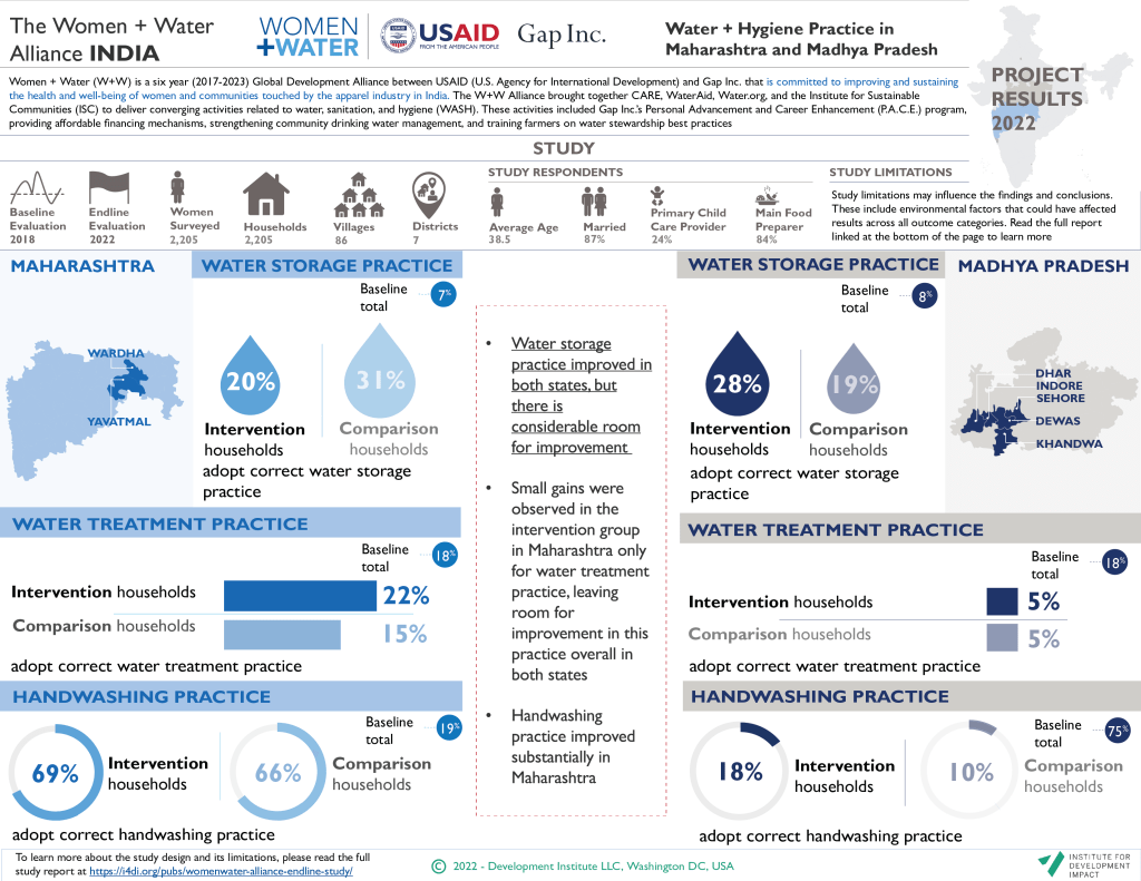
Water + Hygiene Practice in Maharashtra and Madhya Pradesh
The State of Water in Maharashtra and Madhya Pradesh

Convergence of Actions Towards Impact

Guidance for Building a Balanced D-MERL System in a Post Response Recovery

Covid-19 Weekly Watch

As the pandemic draws on and the numbers grow, many people are feeling fatigue from COVID-19 statistics. Often, the magnitude or severity of the case count in a particular region is difficult to grasp without proper context. In looking to make these overwhelming numbers more digestible, in July 2020, I4DI launched a series of weekly posts which aim to bring updated, real-time data and trends to the public in a way that is easy to understand.
Each week, we look at the data with a new lens, offering unique visualizations that present the COVID-19 situation in a simple, but insightful snapshot. Follow along to stay updated!
Findings of a Baseline Study of Women’s Empowerment in Madhya Pradesh, India

This infographic summarizes some of the key findings from a baseline study by carried out in Madhya Pradesh, India, along the Narmada River basin to measure relevant women’s empowerment and WASH indicators. The Institute for Development Impact conducted the study on behalf of the W+W Alliance.
Guidance for Building a Balanced D-MERL System in a Post Response Recovery